Get In Touch , kny0411@naver.com Ph: +33 7 84 92 19 87
⬤ Challenges
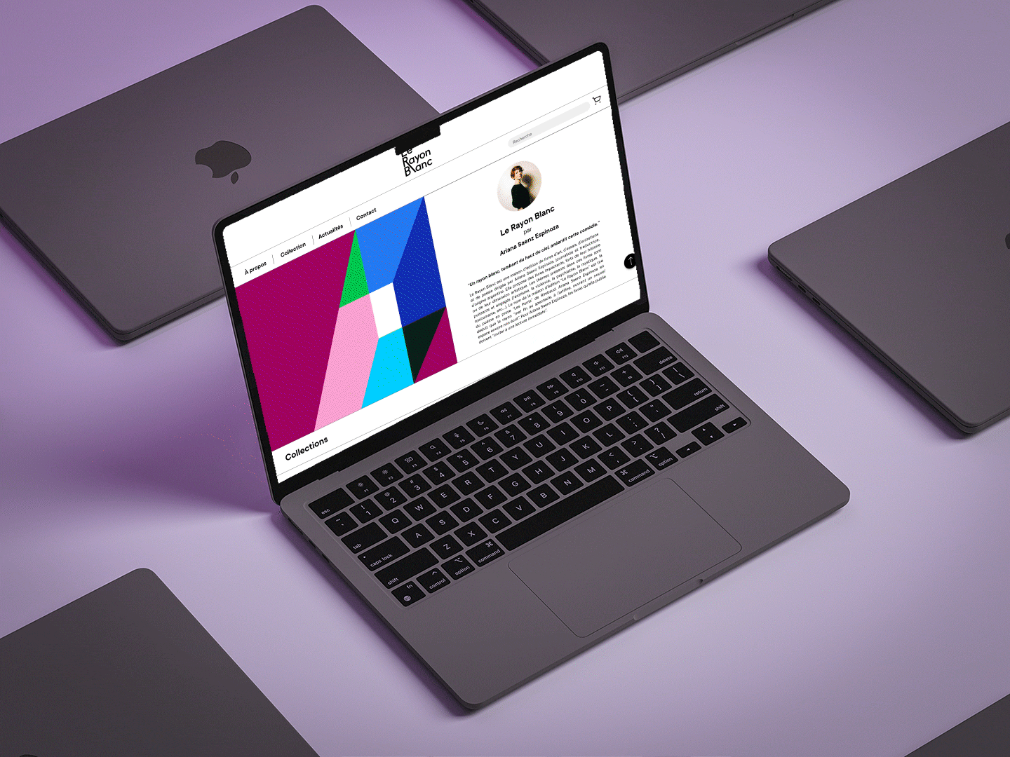
How to create a design system for a publishing house?
Our aim was to create a strong and impactful visual identity through the creation of a cover system, when the publishing house has not yet been launched and the competition is already well established in the market?
⬤ RESEARCH
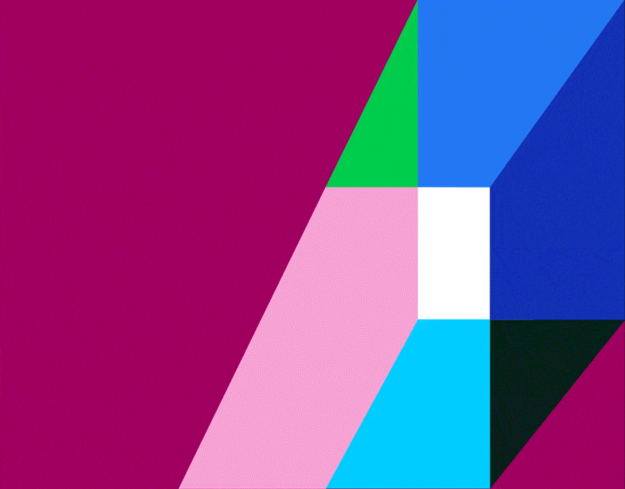
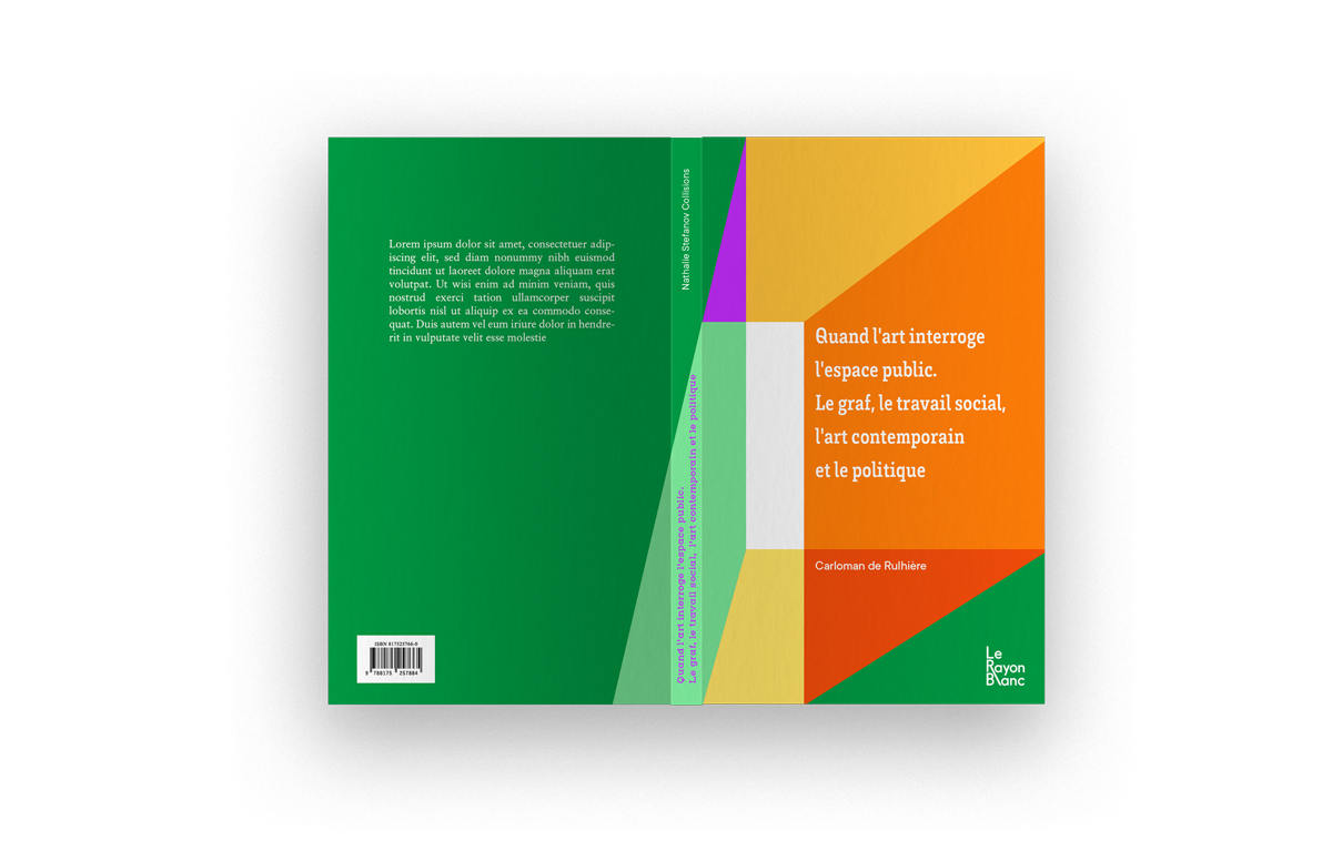
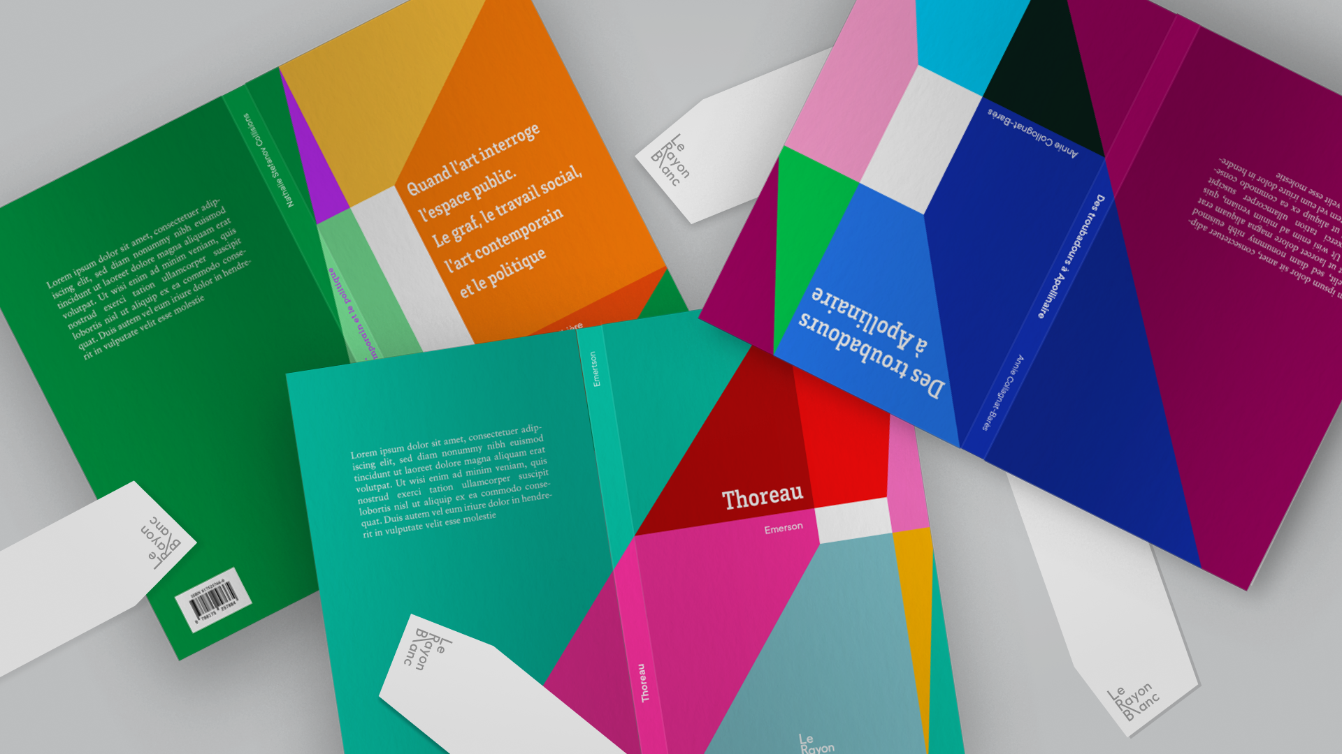
A radical and powerful system
It is built by its geometry and the play of perspective. The latter is subdivided into shapes, leaving room for a powerful interplay of colors and light. We thus find the idea of a kaleidoscope with the appearance of this white area that makes sense. It is an active area, reminiscent of a page.
Geometric power
Subdivision
White area
Chromatic range (monochrome)
1 dominant color per collection
Taking into account the continuity of perspective
⬤ develop
LOGO
The logo is always composed within a square to ensure its reduction and readability on any medium.
We preferred to maintain a particularity: the extension of the bar of the R which takes the place of the L, thus forming the idea of a ray falling from the sky. We adjusted and reduced the gap between the extension bar of the R and the other letters.
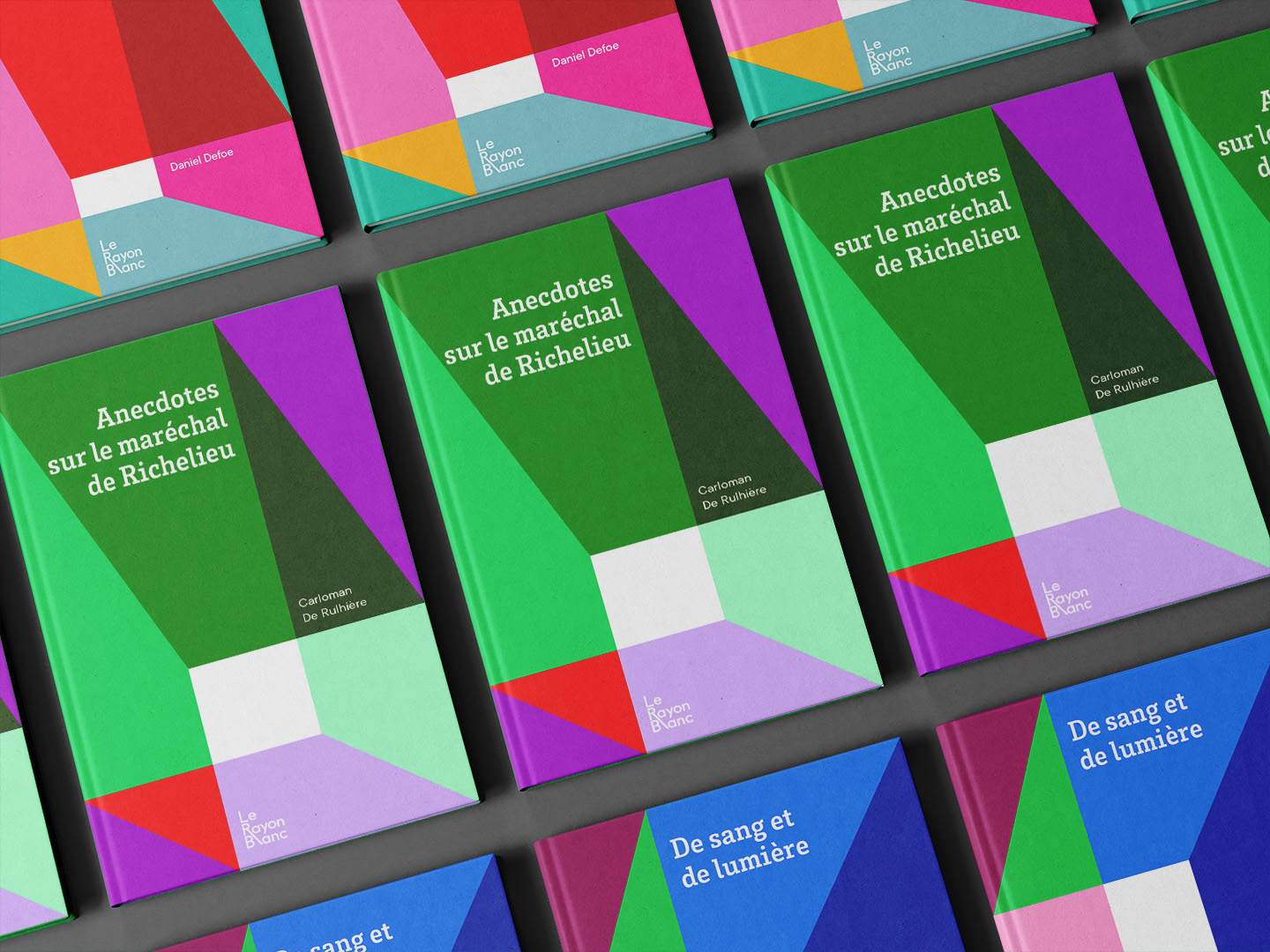
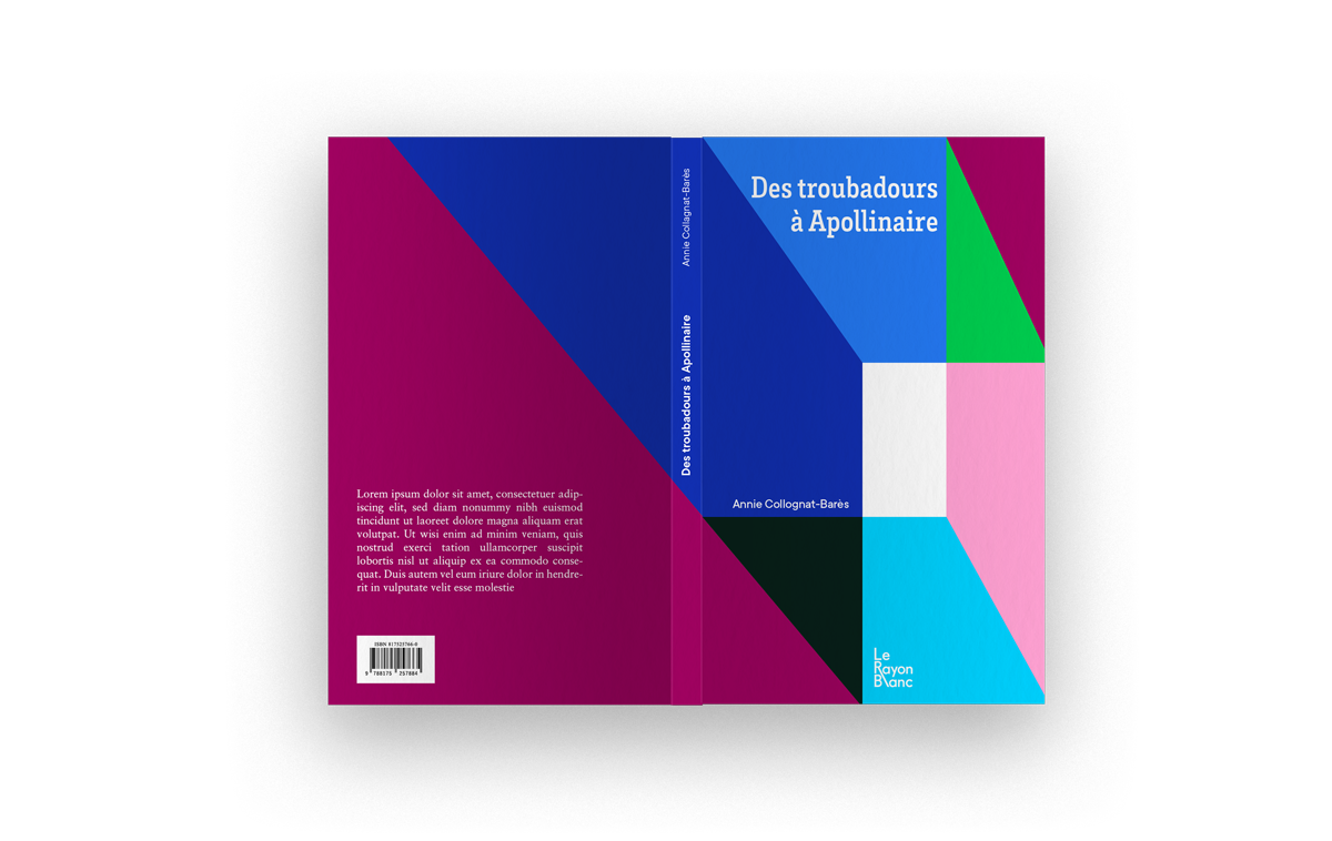
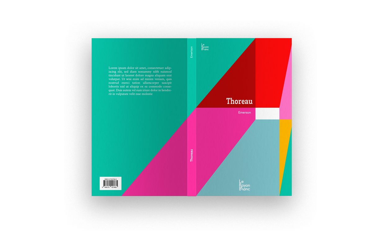
⬤ Creation
The system of cover, with use of color
⬤ And more
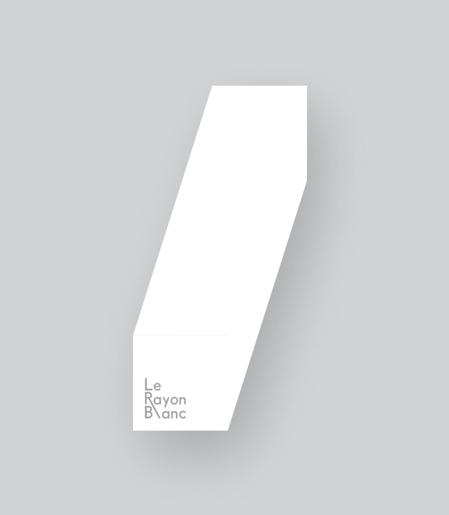
Bookmark, a white ray on the page
Bookmark
Our final choice is a bookmark that differs from a traditional bookmark in its shape. It incorporates our principle of perspective but this time without any subdivisions or colors. It directly evokes the idea of the power of a beam of light.